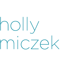
SouthPark Magazine - January 2010
An interesting feature that paired tea with southern foods. I attended this photo shoot with the photographer and helped with food styling and overall vision. This design won an Award of Excellence from the Society of News Design in 2010.
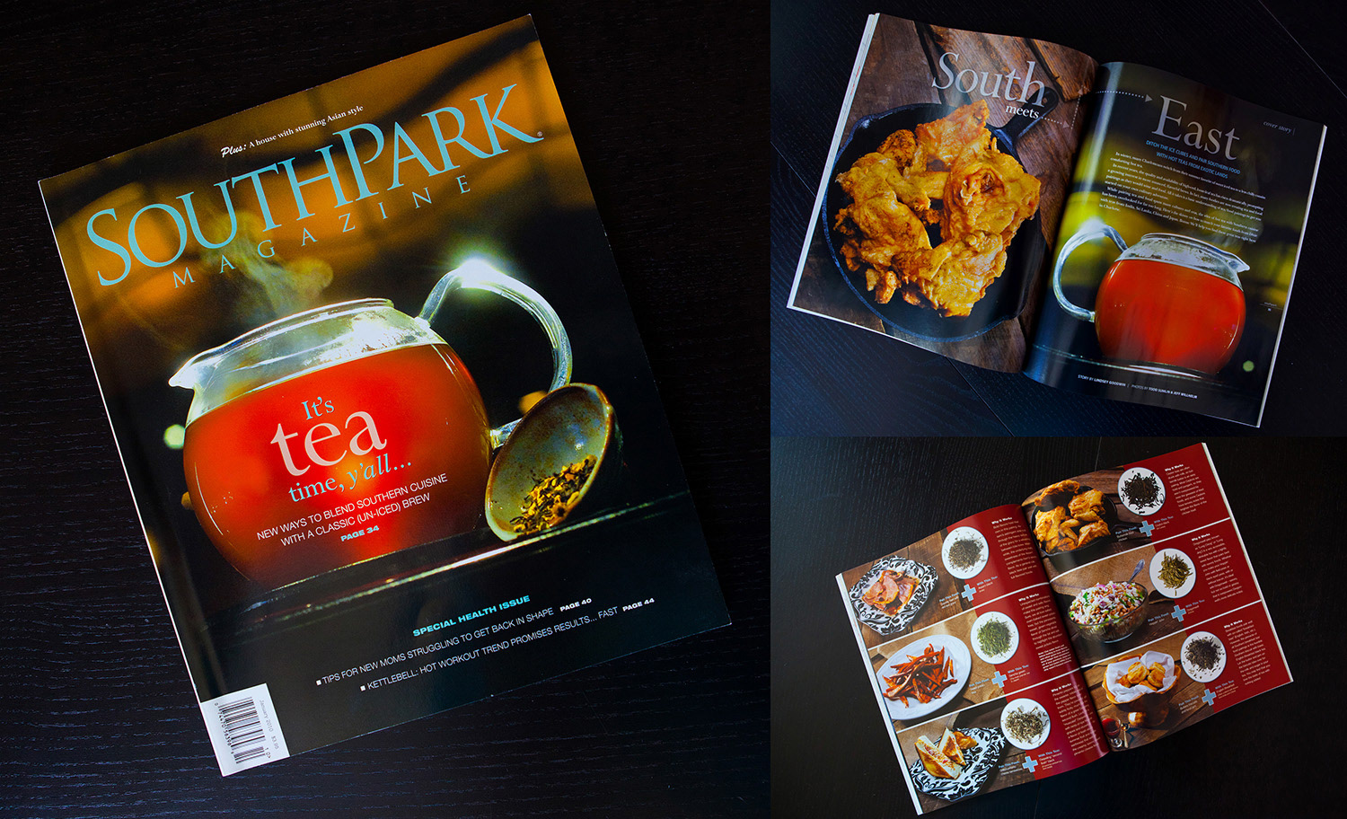
SouthPark Magazine - June 2009
Blue and orange – a classic complementary pair. The subtle calming blue creates a relaxing, yoga-feeling base, while the contrasting orange headline pops from the page.
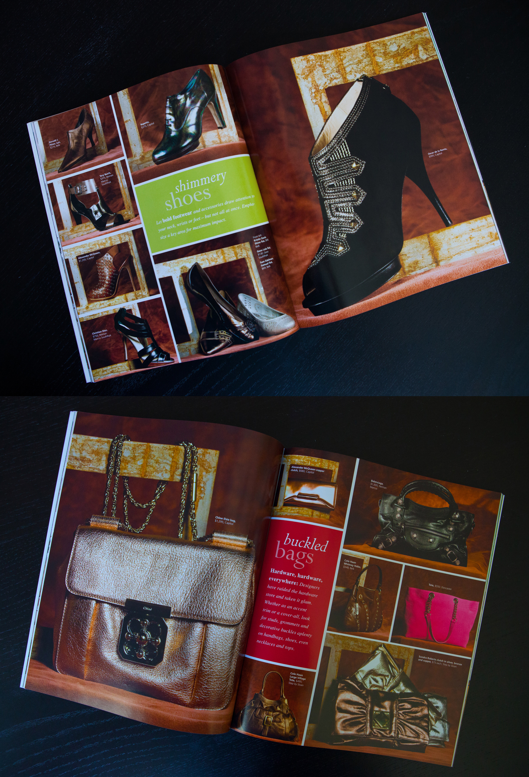
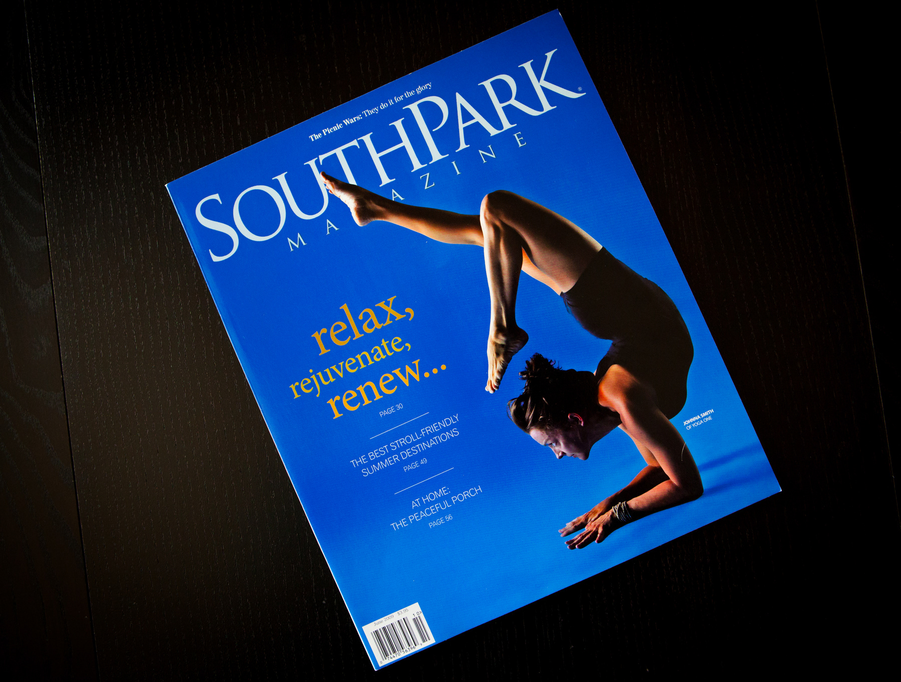
SouthPark Magazine - September 2009
This was one of several fall fashion accessory spreads in the September 2009 issue. It showcases my knack for organizing information. Since the trend for fall was big, bold metal accents, each spread had a similar theme with rusty metal pieces in the background. A simple design, but I scrutinized each placement, down to the green box – an exact color match from the year’s fall lineup of fashion colors, called "warm olive."
SouthPark Magazine - April 2009
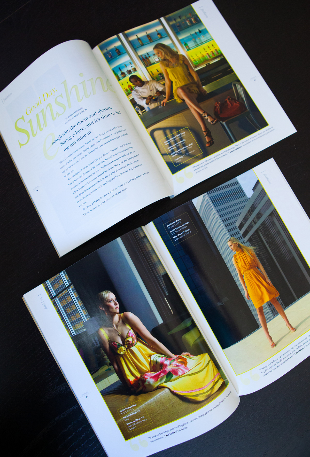
This was a preview to summer fashion that featured all things in bright, sunshine yellow. The photos were amazing, so I stepped back and let them take center stage.
SouthPark Magazine - June 2009
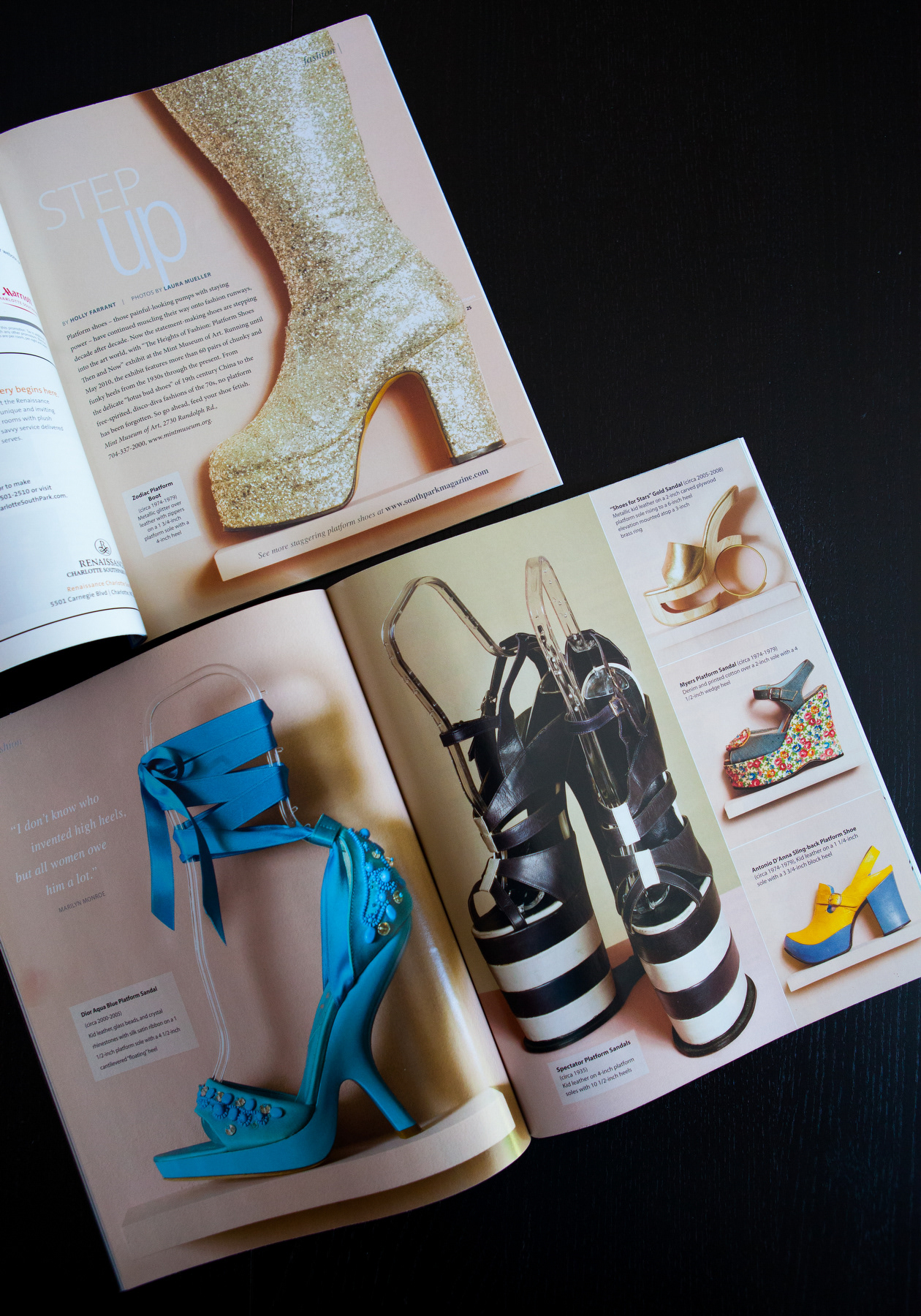
I produced this feature from start to finish. It all began with a press release for a new exhibit at the Mint Museum of Art that caught my eye – ‘Platform shoes, Then and Now.’ After seeing a few samples I knew I had a SouthPark feature on my hands. I immediately set up a photo shoot, wrote a quick intro and let the shoes do the rest.
SouthPark Magazine - August 2009
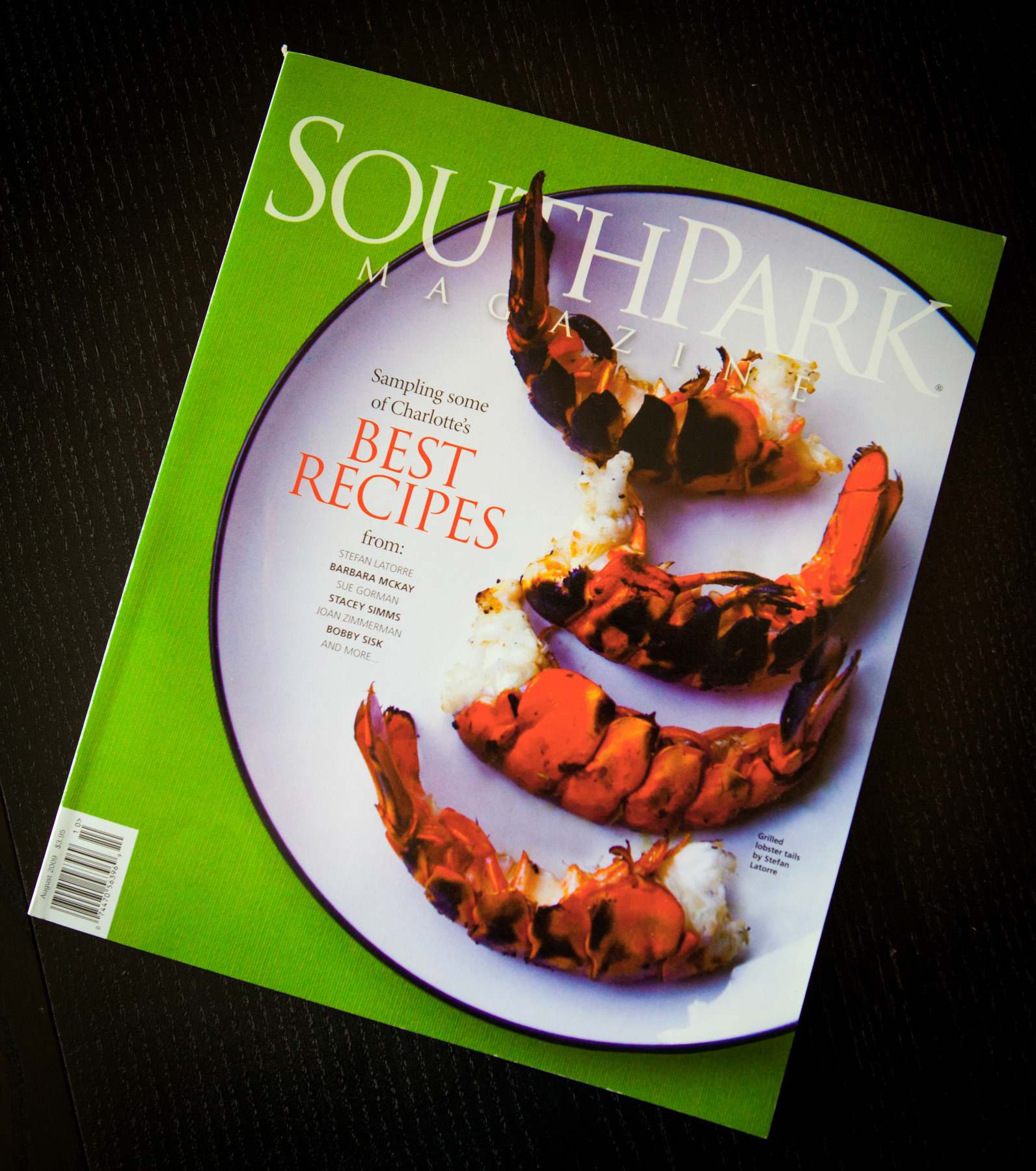
I attended this photo shoot with the photographer as an assistant and “food stylist.” The cook had never prepared food for a photo shoot, and after hours of shooting (and his family waiting patiently to eat), the photographer and I knew we just didn’t have a cover shot. Then it hit me – I asked for a white plate, and the vibrant, orange grilled lobster tails and arranged them on the plate. Bingo, we had a cover. It screams SouthPark home cooking – simple, yet elegant.
SouthPark Magazine - August 2009
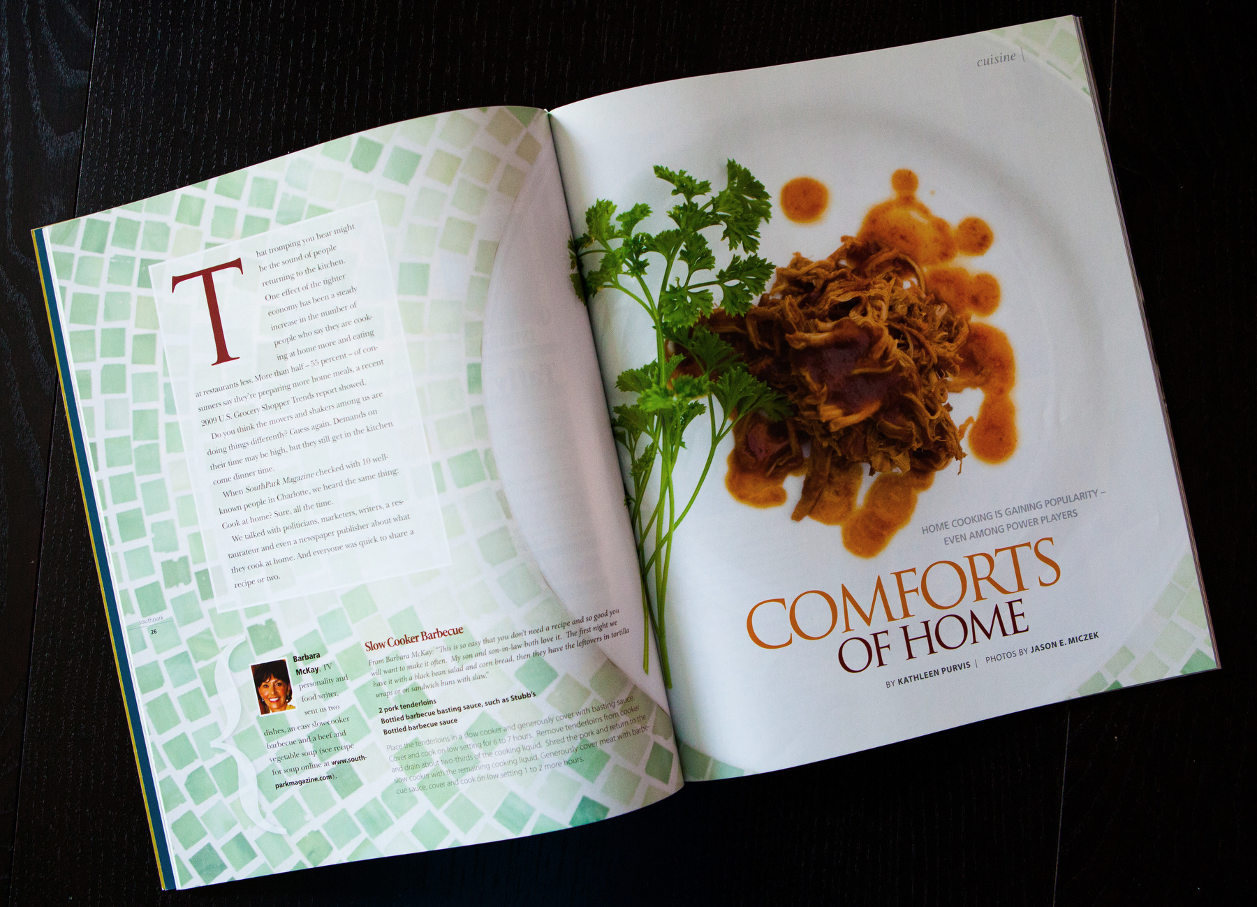
A pet peeve of mine is seeing recipes without accompanying photos. If I’m going to try a recipe, I really want to know what the final product should look like. When I received this story about the easy, home-cooked meals of local Charlotte celebrities, I had 10 recipes, 10 mug shots and only eight recipe photos. Not willing to run a recipe sans photo, I took two recipes home, cooked them myself and had them photographed. The main story spread was actually one of the recipes I cooked and styled, so the extra effort definitely paid off.
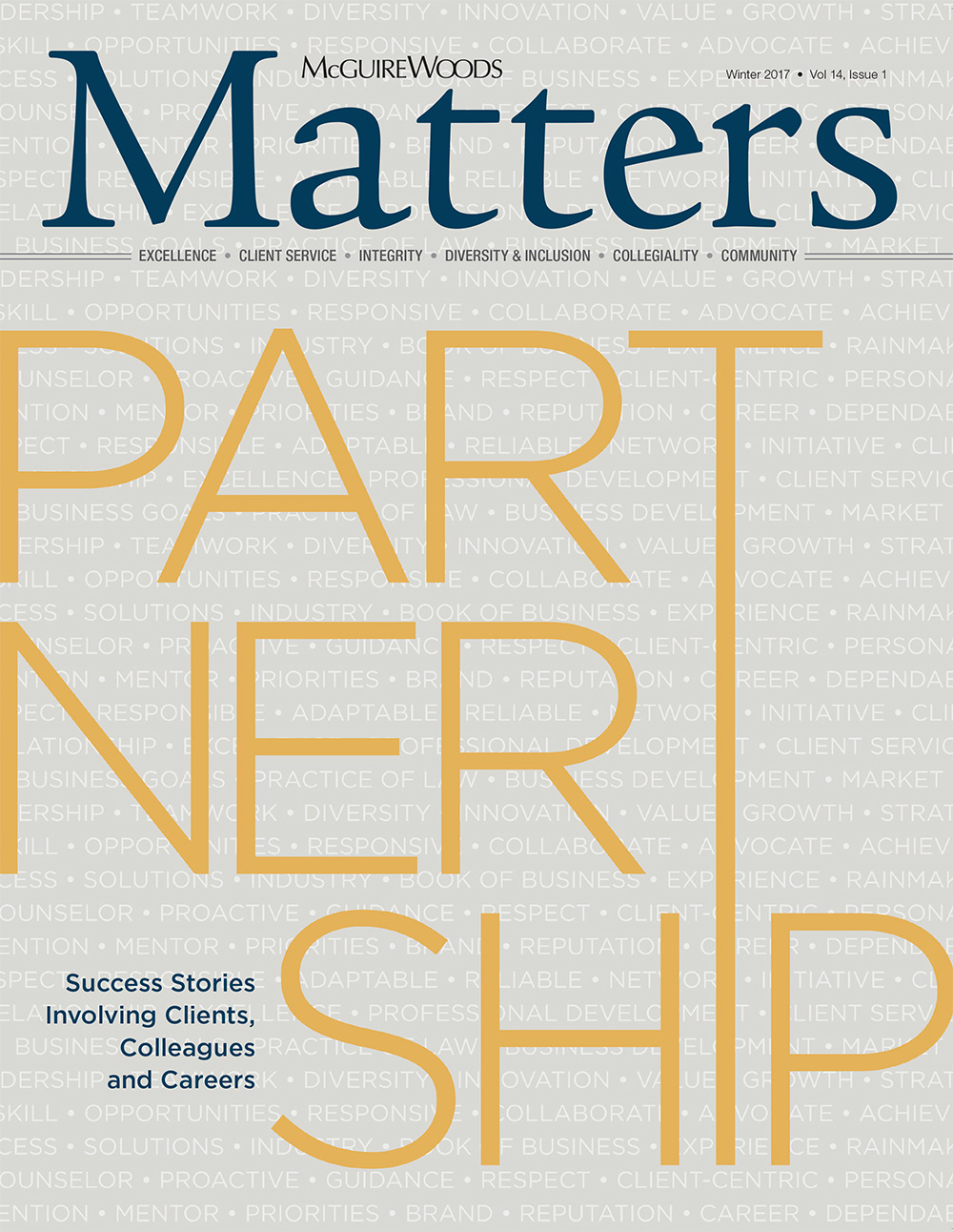
Matters Newsletter
This was a cover for our internal magazine, Matters, at McGuireWoods. The original idea for a team photo fell through and I had mere hours to devise a back-up plan. The feature was a story on our partners and what they thought made them successful as partners, so I went big and bold with the word “Partnership.” Notice how the “T” and “I” connect - almost as if they are partnering or helping each other.